A profoundly human, sensitive and committed project, designed to transform a hospital space that was initially very white, neutral and soulless, into a place of appeasement, comfort and presence, for patients, families and care teams.
In a palliative care unit, every detail counts. Time is experienced differently. The emotions are intense, sometimes silent. The visual environment cannot be left to chance. It is in this awareness that we have imagined a global artistic intervention, where the wall art becomes an accompanying care, discreet but essential, without forgetting its necessarily natural signage.
Think of palliative care as a place of life and relationship
Palliative care is not just about medical spaces. They are places where we accompany, where we listen, where we soothe, where we support dignity and relationships to the end. Patients, relatives and caregivers cross paths there in great emotional intensity.
Before our intervention, the spaces of the department were functional but very marked by extreme neutrality: white walls, impersonal corridors, absence of sensitive landmarks.
The challenge of the project was clear: to humanize the place, without ever overloading it, to bring warmth without erasing the sobriety necessary for care, to create a visual framework capable of reassuring, enveloping and accompanying.
This is precisely the vocation of our approach at Métamorphoze: to design visual environments adapted to health contexts, where art becomes a lever for well-being and readability.
👉 https://metamorphoze.art/lieux/decoration-hopital-clinique-medico-social/
A natural and floral journey as a common thread
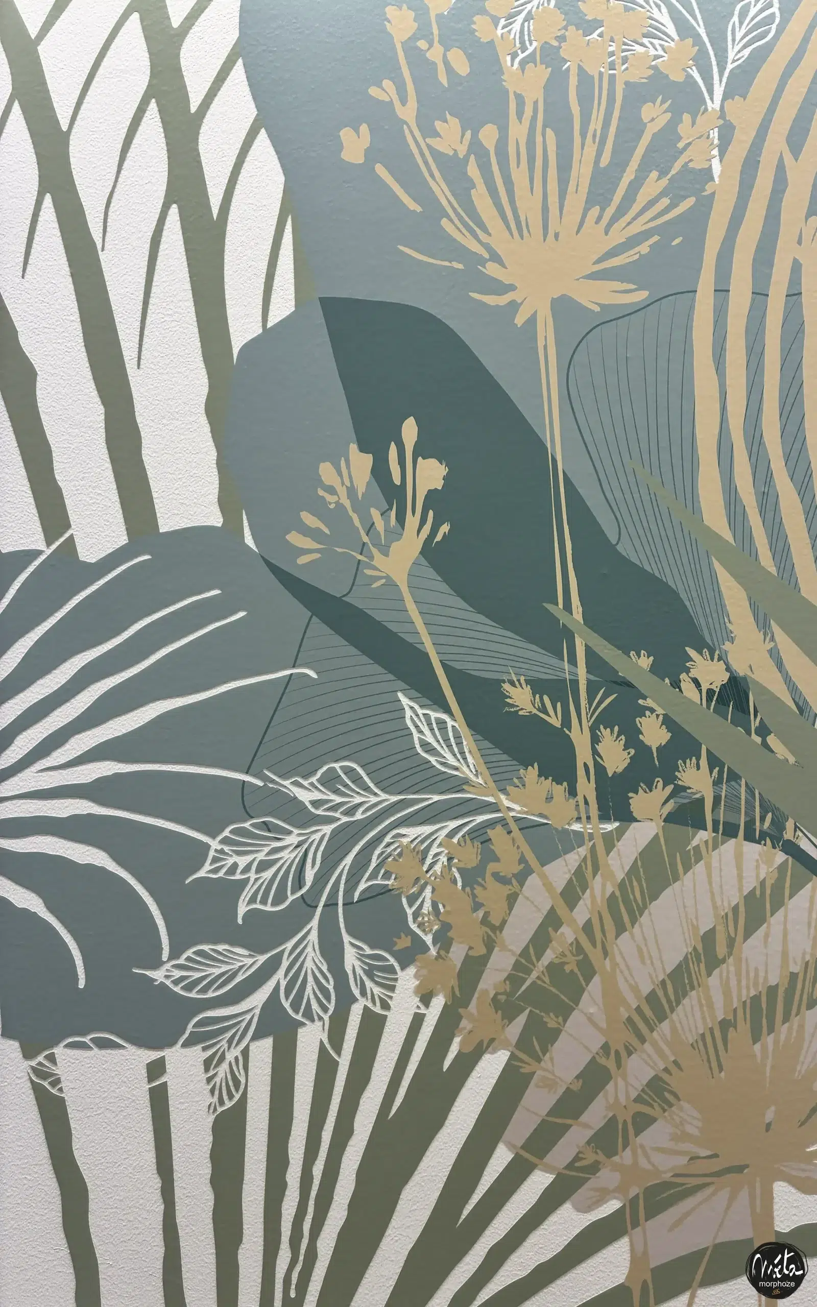
For the CHU Brugmann, we imagined a natural and floral journey, imbued with poetry and softness.
A deliberately soothing universe, far from any heavy or figurative narration, designed to leave room for interpretation, silence and emotion.
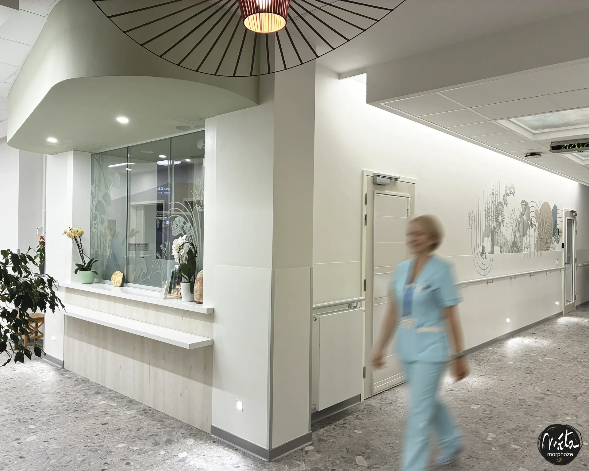
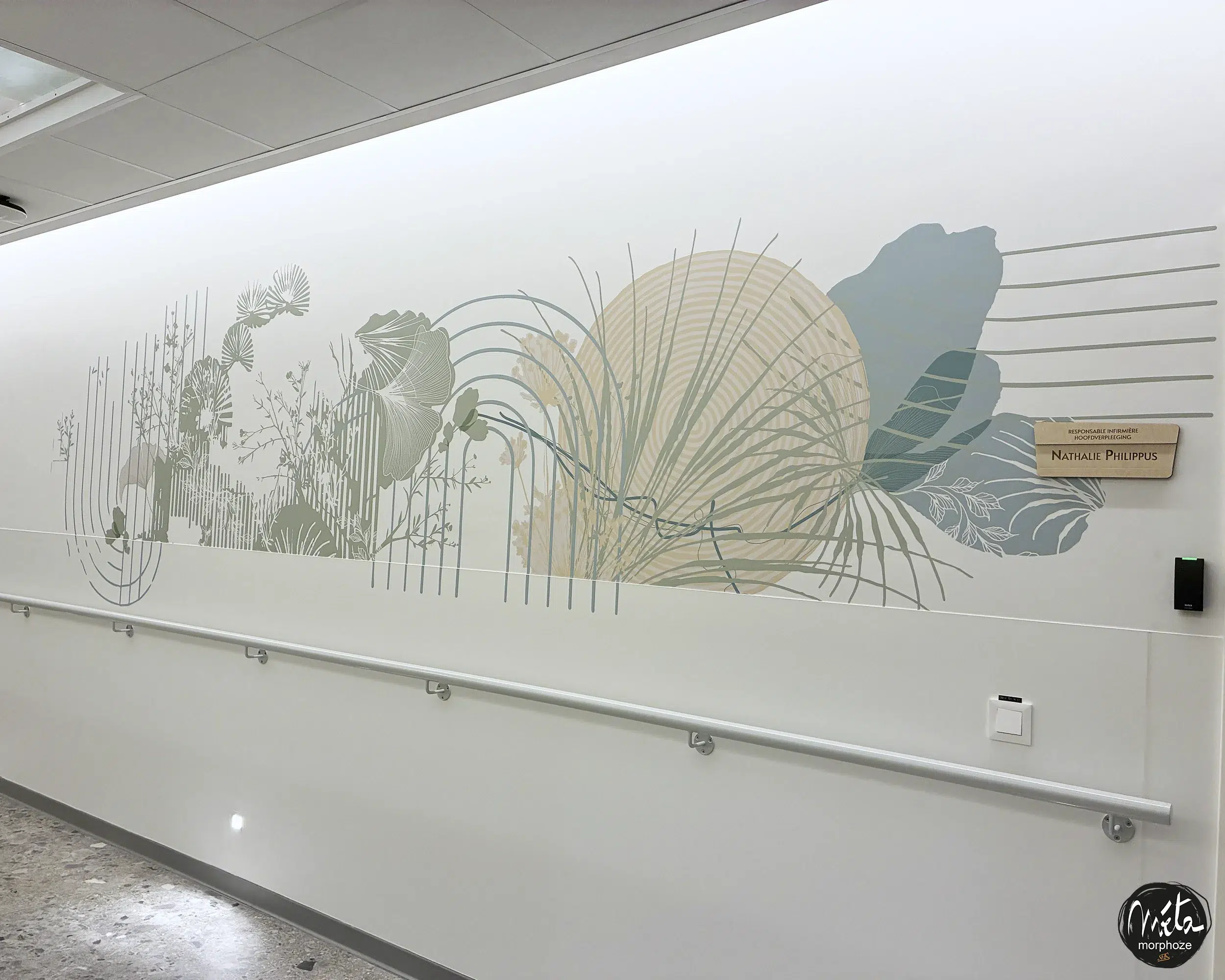
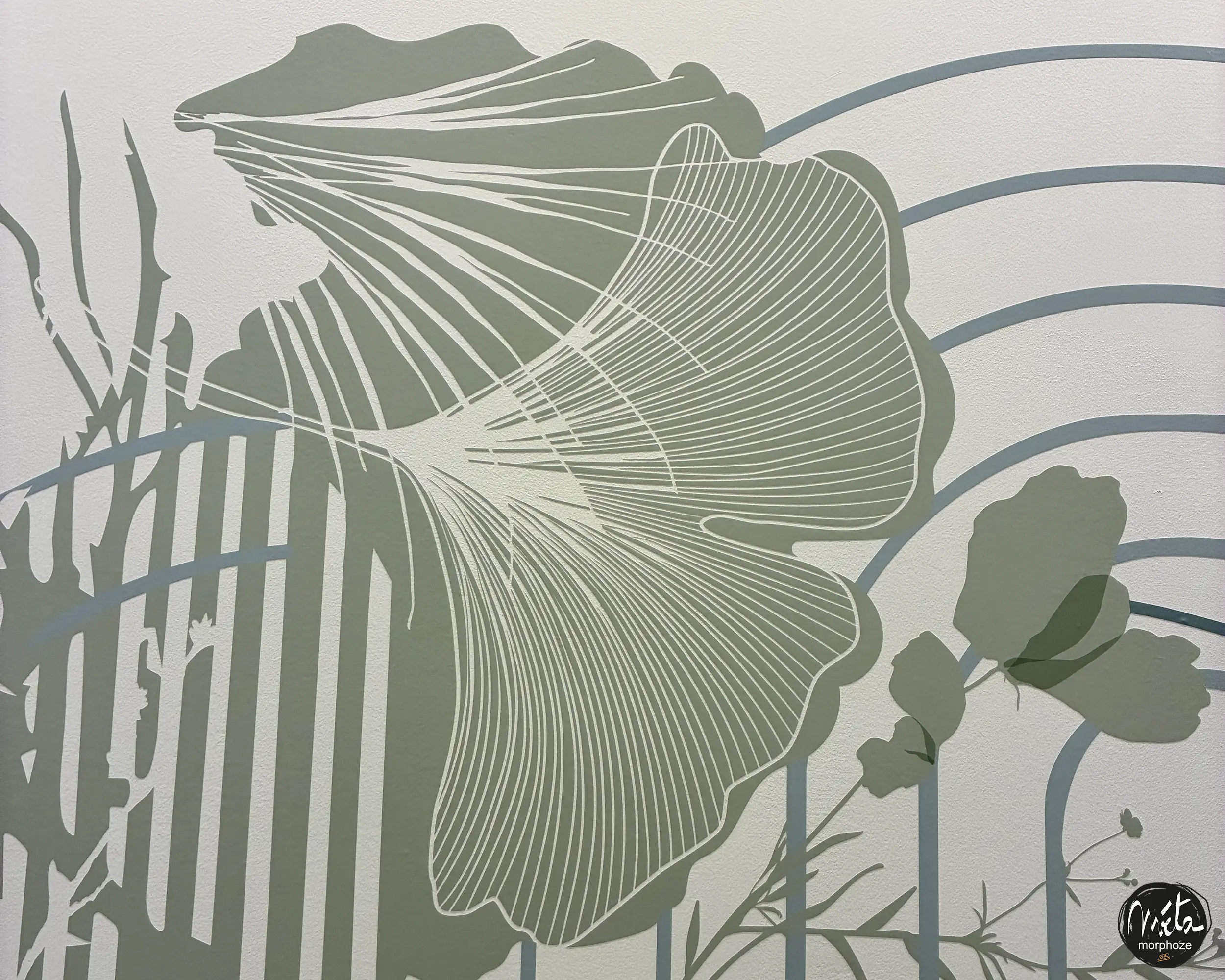
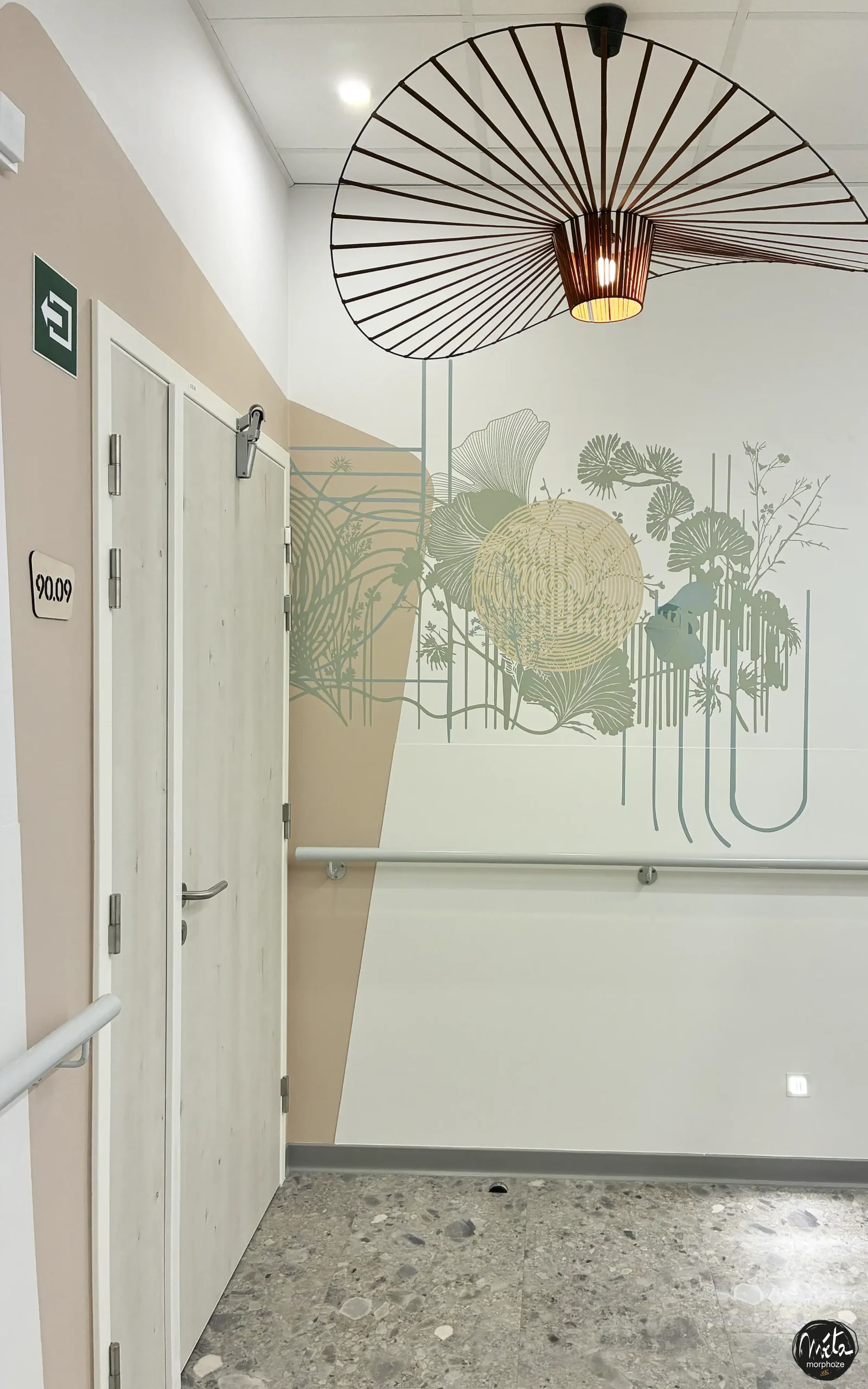
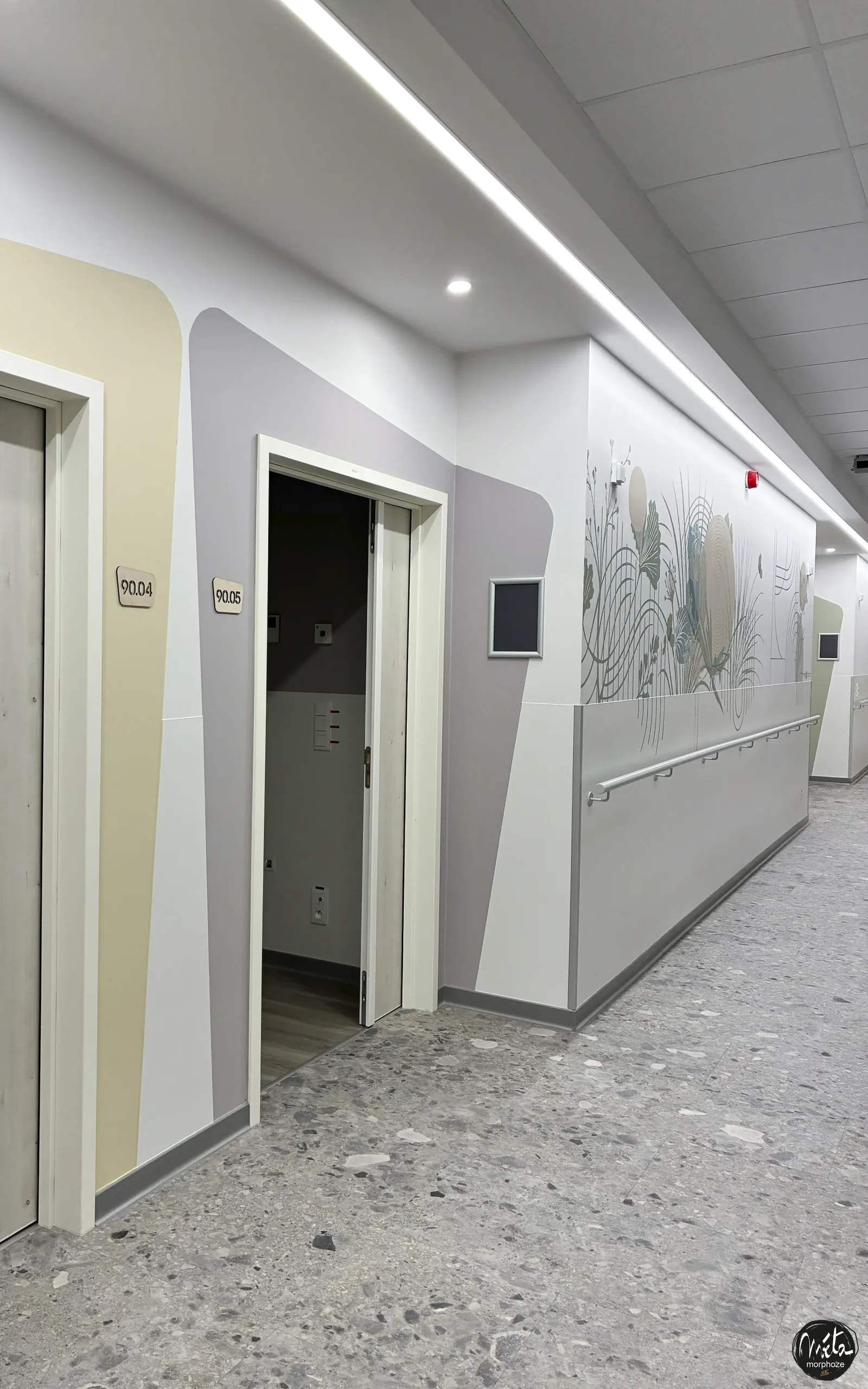
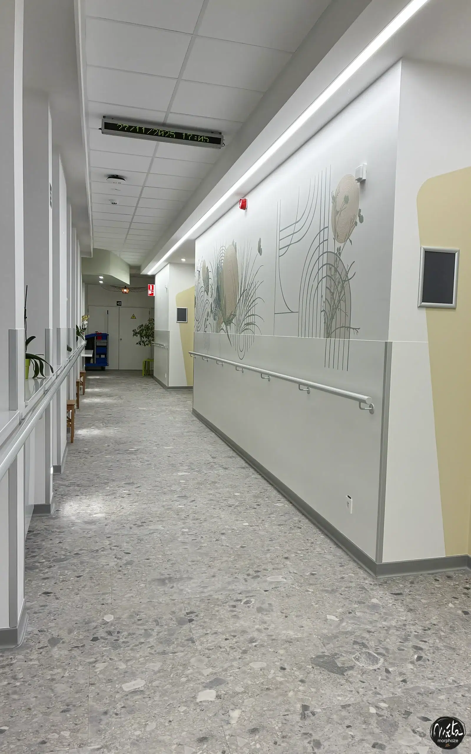
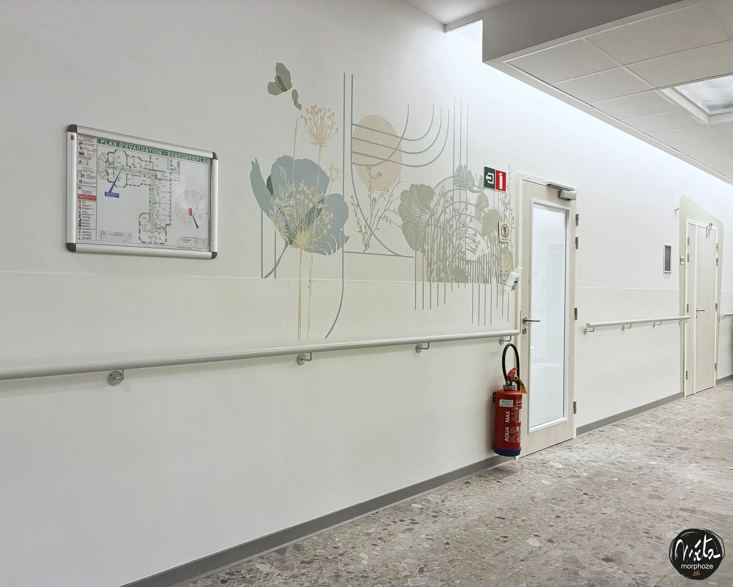
The ginkgo biloba has become one of the central symbols of the project. A thousand-year-old tree, bearer of memory, resilience and continuity, it evokes at once the long term, fragility and strength. Its delicate, line-drawn leaves unfold on the walls like a breath.
Around this plant, we have integrated ergonomic, soft, enveloping geometric shapes, designed to accompany the gaze without ever attacking it. These shapes structure the space, create visual cues and guide movements while maintaining a great graphic lightness.
Hand-drawn frescoes and signage, at the service of emotion
All the wall decorations were made in the form of hand-drawn, unique, line frescoes.
The choice of manual drawing is fundamental in a place like this. It brings a human presence, a soft imperfection, a vibration that contrasts with the coldness sometimes felt in hospital environments.
Each line is designed to be legible, fluid, soothing.
The line is never harsh, never abrupt. It accompanies the gaze, invites contemplation, sometimes simply breathing.
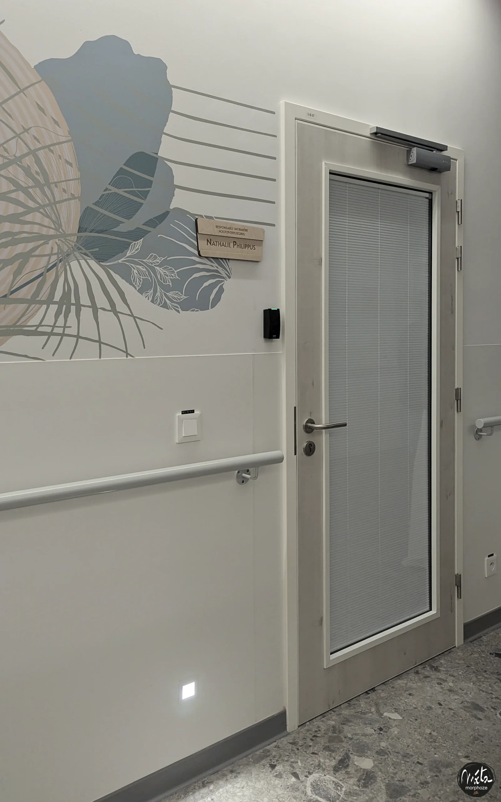
These frescoes are deployed in the circulations, common areas, lounges, reception areas, but also near the rooms, so that each visual path is coherent and reassuring.
Discreet and universal messages of comfort
At the heart of this intervention, we have integrated messages of comfort, chosen with extreme care.
These are not injunctive phrases or slogans, but simple, benevolent, open words, capable of supporting without imposing.
These messages accompany:
- patients, in their privacy,
- families, in expectation or emotional fatigue,
- caregivers, in their daily commitment.
They are graphically integrated into the frescoes, as if they were part of the landscape. They can be read or discovered, depending on each person’s state of mind.
Artistic signage designed for serenity and orientation
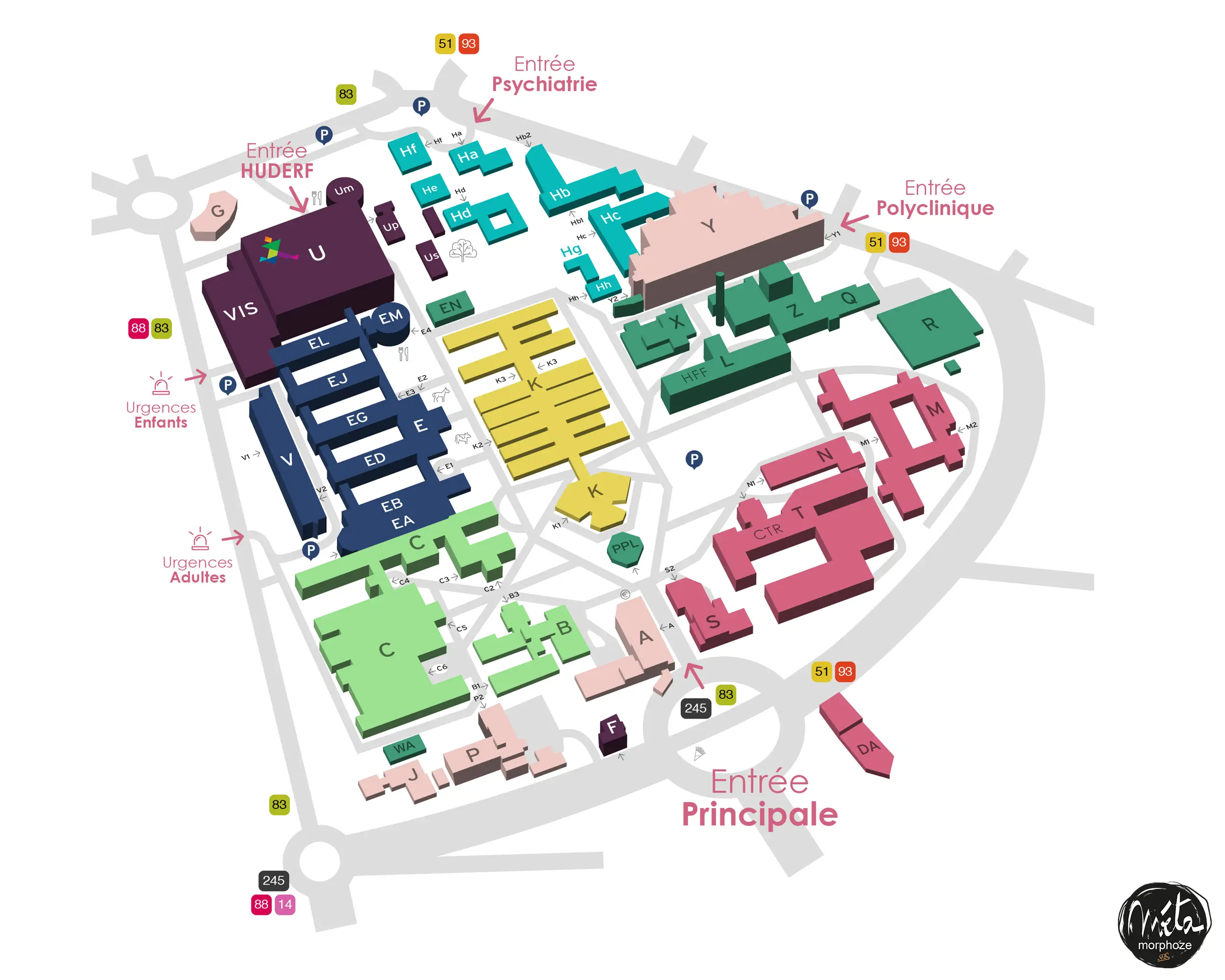
In a hospital department, and even more so in palliative care, clear movement is essential. Getting lost, hesitating, looking for a place can generate additional unnecessary anxiety.
We have therefore designed a complete artistic signage, perfectly integrated into the floral and geometric universe:
- illustrated floor plans,
- directional wall signage,
- door markings,
- legible and soft pictograms,
- window stickers on the glass doors.
Signage is never cold or purely technical. It is part of the same graphic language as the frescoes, so that orientation is done naturally, without visual break.
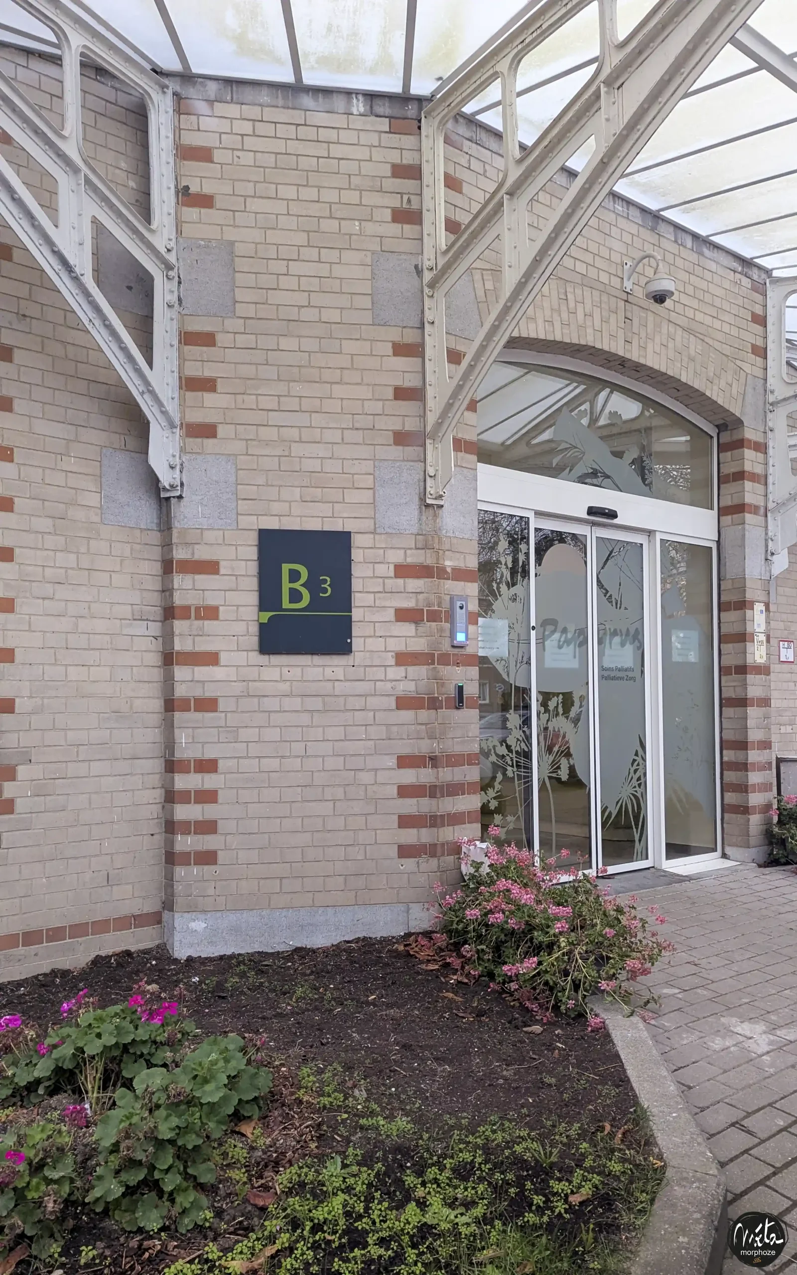
Window stickers: safety, accessibility and aesthetic continuity
On the glass doors, we have installed an artistic window sticker, in frosted film, meeting PMR standards while maintaining a strong aesthetic dimension.
This window sticker ensures visual safety, legibility of the glass surfaces and respect for confidentiality, while extending the graphic journey.
The plant and geometric patterns thus become soft landmarks, visible at regulatory height, perfectly integrated into the overall project.
👉 https://metamorphoze.art/vitrophanie/design-artistique/
More humane rooms, without ever being intrusive
In the rooms, the artistic intervention has been thought out with extreme restraint.
It was not a question of imposing a strong visual presence, but of offering a discreet accompaniment, a light, almost silent graphic presence.
The frescoes are more minimalist, often located in the patient’s natural field of vision, in order to create a feeling of envelopment and continuity with the common areas.
Full compliance with institutional standards and requirements
All of our intervention strictly complies with all the standards in force in terms of:
- PRM accessibility,
- readability,
- visual contrasts,
- security,
- of traffic.
The project is designed in perfect compliance with the requirements of the ARS, and even beyond, by integrating the principles of sensitive accessibility, adapted to the physical, cognitive and emotional fragility of the people welcomed.
Our experience in medico-social and health establishments allows us to intervene with absolute rigor, while maintaining a real artistic freedom in the service of care.
👉 https://metamorphoze.art/realisations/lehpad-decoration-signaletique-conforme-ars/
Transforming a neutral space into a place of comfort
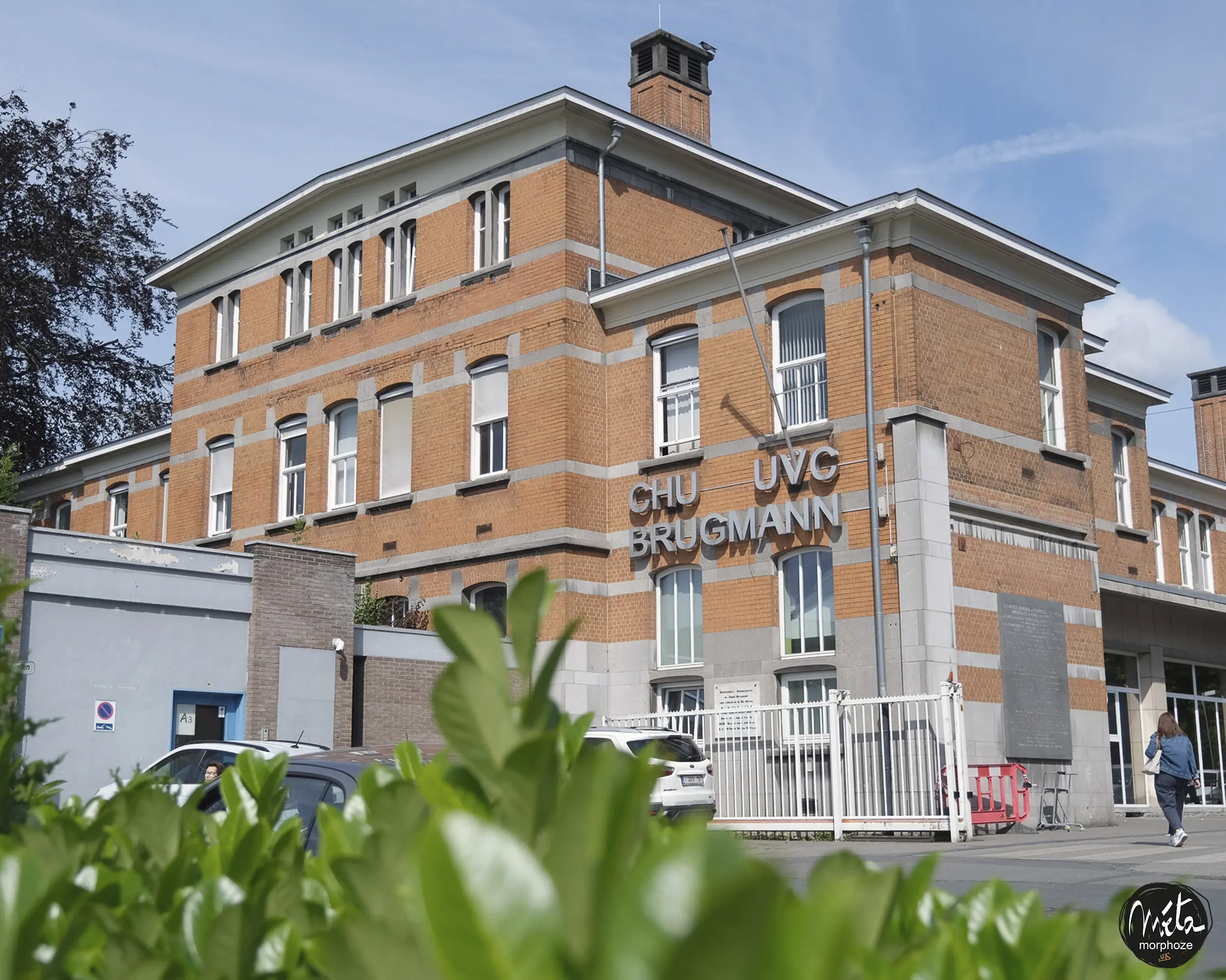
Before our intervention, the palliative care spaces of the Brugmann University Hospital were functional but very impersonal.
Today, they tell us something else: an attention paid to people, a desire to accompany differently, a recognition of the importance of the living environment to the end.
The corridors become soothing paths.
Living rooms are becoming warmer places to share.
The reception becomes a space to breathe.
The rooms become softer without losing their sobriety.
Wall art as an invisible but essential care
This project fully illustrates our conviction: first aid is often visual.
What we see when we enter a place of care conditions the emotional state, the level of stress, the ability to feel safe.
In palliative care, this dimension takes on even greater importance. Mural art does not heal in the medical sense, but it accompanies, soothes, humanizes, respects.
This is the philosophy that we defend at Metamorphoze, through each of our health care projects.
👉 https://www.metamorphoze.art
A profoundly human project
With this intervention within the palliative care of the Brugmann University Hospital, we wanted to demonstrate that mural art and artistic signage can play an essential role in the most sensitive care pathways.
A natural and floral journey, hand-drawn, designed to reassure without invading, to guide without constraining, to accompany without ever imposing itself.
A project where art becomes presence, where the wall becomes support, where space becomes a silent partner of care.
Because, even in the most fragile moments, beauty, poetry and gentleness have their place.