Stylized plants, poetic maps, molecular formulas, key dates, business icons, graphic patterns and a bright and contemporary color code: so many elements that make up a coherent, lively and deeply identity-based visual narrative.
An anniversary commission, a story in motion
Celebrating a company anniversary is much more than hanging a commemorative logo. It is to create a moment and a space where memory and projection meet. From the first exchange with the Explorair teams, the intention was clear: we needed a work that tells the story – the activity, the technical culture, the human and technological milestones, the stages of growth – without ever falling into didacticism. The fresco had to inform without explaining, inspire without imposing, guide without coercing.
So we designed a course that reads like you breathe: a flow. The breath of the reception hall begins the narration; the main corridor unfolds the chapters; The stairwell makes it rise in altitude, gives it breadth and point of view. The visitor enters, advances, rises: he follows a story.
From the hall to the stairwell: a triptych of spaces, a single identity
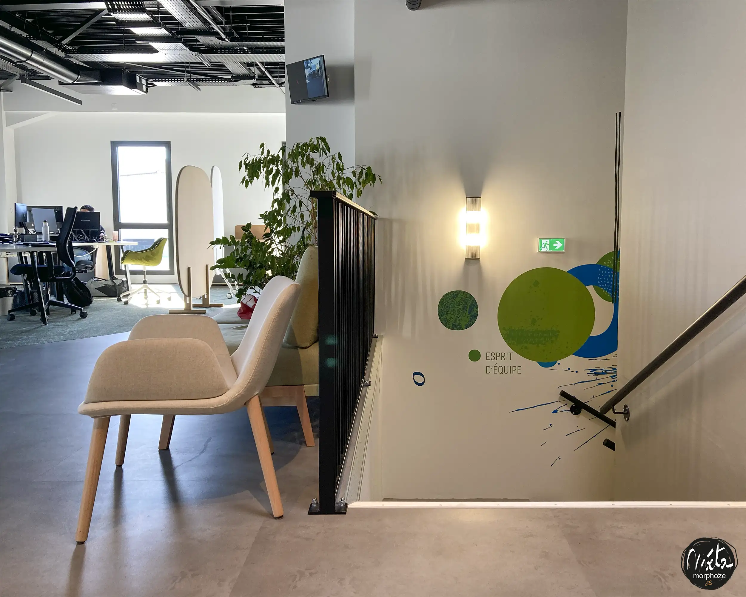
1) The reception hall: the first inspiration
The entrance introduces the central theme: air as living matter. Here, the first plant elements appear in the form of graphic herbaria and geometrized foliage. They are not decorative: they embody the environments, the sources, the contexts where the air is charged, transformed, measured. These organic silhouettes are joined by cartographic fragments – relief lines, isobars, contour lines – which evoke the company’s areas of intervention.
Formulas and fragments of molecular structures, drawn with the finesse of technical ink, emerge like keywords: C₆H₆ to evoke BTEX, CO, O₃, NO₂… So many discreet signs, integrated into the composition, which immediately speak to the technical teams while remaining accessible to visitors. Above, a timeline initiates the story: the company’s key dates punctuate the wall in regular rhythms, each associated with an icon or a motif (a sensor, a sampling case, a stylized chromatogram, the silhouette of a mobile laboratory, etc.).
2) The main corridor: the heart of the story
The main corridor plays the role of a central chapter. We have ordered the story into “stations”, like the panels of a continuous comic strip. Each station combines:
- A date and a milestone, inscribed in condensed, clear and legible typography.
- A central motif (an innovation, a landmark project, a certification, a site opening, a new protocol, a partnership, an expanded service).
- A landscape (urban, industrial, natural) translated into geographical flat areas and orientation textures (striations, hatching, dotted lines) that recall the languages of cartography and analysis spectra.
- A molecular wink, sometimes reduced to a hexagon, a bond, a radical, depending on the desired complexity.
This progression is designed to be read at two speeds: at a walking pace, the eye picks up the colour, the landmarks and the milestones; When stopped, micro-details are revealed (annotations, micro-icons, fine lines). The message: Explorair is written over time, through precision and attention to the environments.
3) The stairwell: gain height
In verticality, the fresco changes scale: geography becomes horizon, the lines of flow widen into ribbons that rise and intersect. We composed an ascent: as you climb, the patterns become simpler, the palette gains in light, the typography becomes more airy. It is the metaphor of an expertise that is being refined, of a vision that is elevating.
Translucent layers – semi-opaque bands where spectra, calibration curves, diagrams slide – suggest the language of measurement without freezing the reading. On the upper level, a concluding panel brings together the whole: a synthetic timeline , a footprint map, a manifesto phrase chosen with the management team and a graphic nod to the 20th anniversary.
A bright and contemporary color code
The chromatic identity, redesigned for the occasion, is based on a founding duo: air blues and living greens. We declined:
- Bright primary blue for axes, titles, guides;
- Deep blue for contrast backgrounds and technical layers;
- Chlorophyll green for plants, environmental health, regeneration;
- Mineral green (cooler) for engineering, rigor, data.
These coloured masses are warmed by punchy graphic accents (a signal yellow, a punctual coral) that underline dates, progression arrows and reading markers. The result: a lively, clear and contemporary identity, which gives rhythm to the circulation while aligning itself with the Explorair universe: mastery, precision, impact.
Visual language: reconciling scientific and sensitive
Our bias was to hybridize three registers:
-
The scientist : molecular structures, curves, line diagrams, revisited standardized pictograms;
-
Geographical : relief lines, grids, abstract latitude/longitude grids, “soil”, “water”, “urban” textures;
-
The living : seagrass beds, leaves, twigs, silhouettes of stylized insects or birds, air flows materialized by graphic nets.
This triangulation makes it possible to speak to both experts (who recognize their objects) and everyone (who reads a landscape). The formulas are integrated like motifs : never plastered, always composed on the scale of space, sometimes in light superimposition, sometimes in reserve in color. The whole aims at an obvious fact: science is a look at the living, the analysis of the air is a listening to it.
A timeline that highlights key dates
At the heart of the project, the timeline brings together the milestones of 20 years of history. To make it useful, memorable and elegant, we have:
- Chose a sans-serif typeface with variable width: legible from a distance, elegant up close;
- Hierarchical information: year in strong, title in median, detail in discrete;
- Associated each milestone with a visual reference point (tool icon, sensor icon, map of a key territory, symbol of a new method);
- Embedded duotone vectorized stock photos in certain sections of the corridor, to visually anchor the human steps.
The frieze is not linear in the strict sense: it curves, goes around a door, goes up on a riser, widens at the landing… It inhabits architecture to better reveal it.
An experience for visitors, a mirror for teams
A corporate mural is only successful if it speaks to both audiences : those who discover the house and those who bring it to life.
- For visitors, the fresco becomes a silent onboarding : in three minutes, we understand the profession, the demands, the scope of the interventions and the depth of the story. We remember dates, we memorize landmarks, we identify a posture: precision, respect for environments, continuous progress.
- For the teams, it is a rewarding mirror: the business gestures, the tools, the terrain, the milestones – everything is there, stylized but faithful. The route gives pride and landmarks, it connects services and reenchants everyday spaces.
During the first strolls, we observed spontaneous stops in front of certain milestones, exchanges around molecular details, comments on the sites mentioned. The fresco becomes conversation.
Responsible design, sustainable implementation
Because talking about air quality is engaging, we have taken care of the sobriety of the means and the durability of the supports :
- Inks and paints selected for their low emissions and durability over time;
- Matt protective varnish to maintain readability while facilitating maintenance;
- Supports adapted to the constraints of the hall and stairwell (traffic, friction, light);
- Installation devices to limit nuisances: interventions in sequences, masking and marking of circulation, fine coordination with the teams on site.
The result is a perennial work, easily cleanable, designed to preserve its brilliance and legibility.
Methodology: co-construction, precision, tempo
The project was built in four stages :
-
Immersion – site visits, surveys, documentation, collection of dates and milestones, exchanges with teams (management, technical, fieldwork, communication).
-
Design – framing of the colour code, constitution of a graphic vocabulary (pictograms, textures, maps), drawing of the first sequences, scale models and 3D simulations of the spaces (hall, corridor, stairs).
-
Iterations – adjustments with the teams: checking formulas and symbols, refining labels, choosing historical focuses .
-
Realization – preparation of supports, tracing, coloring, integration of technical details, varnish and delivery.
Throughout the process, we looked for accuracy : the right amount of information, the right graphic density, the right level of contrast. The objective: for the fresco to accompany the uses without dominating them.
Language details: small attentions, big effects
Some of the choices that make the difference on a daily basis:
-
Flow arrows : thin chevrons indicate the natural direction of reading, useful in the hallway and staircase.
-
Micro-captions : very short words (“measure”, “qualify”, “protect”, “innovate”) act as mantras in the journey.
-
Zoom levels : The same pattern (sheet, sensor, map) reappears at different scales, creating visual continuity.
-
Breathing : plain beaches, deliberately left quieter, offer pauses to the eye and preserve the legibility of the doors and regulatory signage.
-
Alignments : the timeline hangs the frames, seat heights, stair rails; The fresco “composes” with the architecture.
A reaffirmed identity
Remaking the identity of a place is not about imposing a charter: it is about organizing perception. Colours, rhythms, textures, words and signs have been composed so that each area – reception, passage, ascent – tells the story of Explorair in a singular but coherent way.
The bright and contemporary colour code connects the fresco to the present: it translates a company in motion, an expertise that is being updated, a permanent attention to the environment. In high-traffic areas, it gives energy and landmarks; In the stairwell, it brings clarity and elevation.
What this mural changes
- For the image : a strong marker, immediately memorable, which transforms the visit into an experience and aligns the environment with business excellence.
- For the routes : an intuitive reading of the space, natural stopping points, a direction of circulation that makes you more comfortable.
- For internal culture : a common, tangible narrative that unites teams around a living heritage: 20 years of evidence and promise.
- For sustainability : a sustainable, maintainable work that enhances the site on a daily basis.
Epilogue: 20 years on the walls, the future in clear line
By deploying this anniversary fresco, we wanted to offer Explorair a tool of hospitality and a support of pride. The work embraces plants (to remind us that air belongs to the living), geography (to inscribe action in territories), chemistry (to honor precision and science) and history (to recognize the long term, decisions, teams).
The hall welcomes, the corridor tells the story, the staircase rises. And everywhere, colour gives rhythm and presence. It is a fresco that is traversed like a file of sensitive evidence: we see the work, we feel the vision, we read the demand.
Twenty years is a milestone. The walls of Explorair now announce it clearly: the company breathes the future. And each passage through these spaces reminds us of the promise: to measure in order to better protect, to understand in order to act better, to tell stories in order to better federate.