This artistic creation, entirely hand-painted in acrylic paint, is part of a process of identity and architectural enhancement. More than a decorative intervention, this fresco is the visual manifesto of the Chois brand, an emblematic company of Korean gastronomy, anchored in modernity while remaining proud of its heritage.
A monumental fresco as an emblem of brand and identity
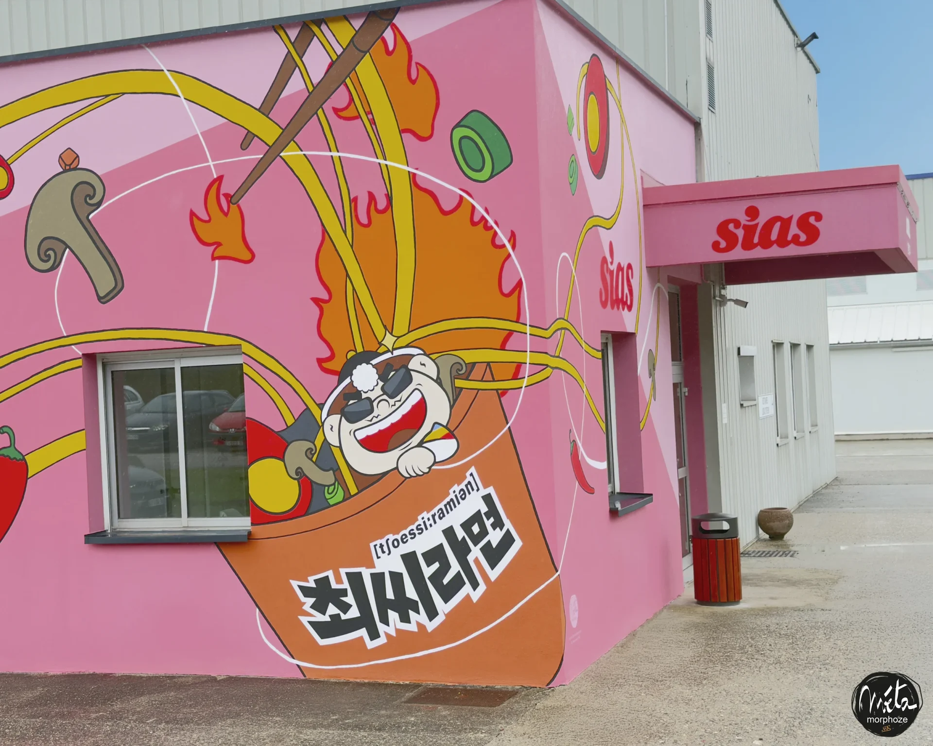
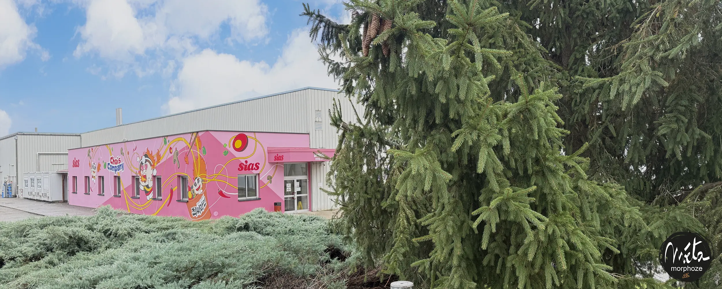
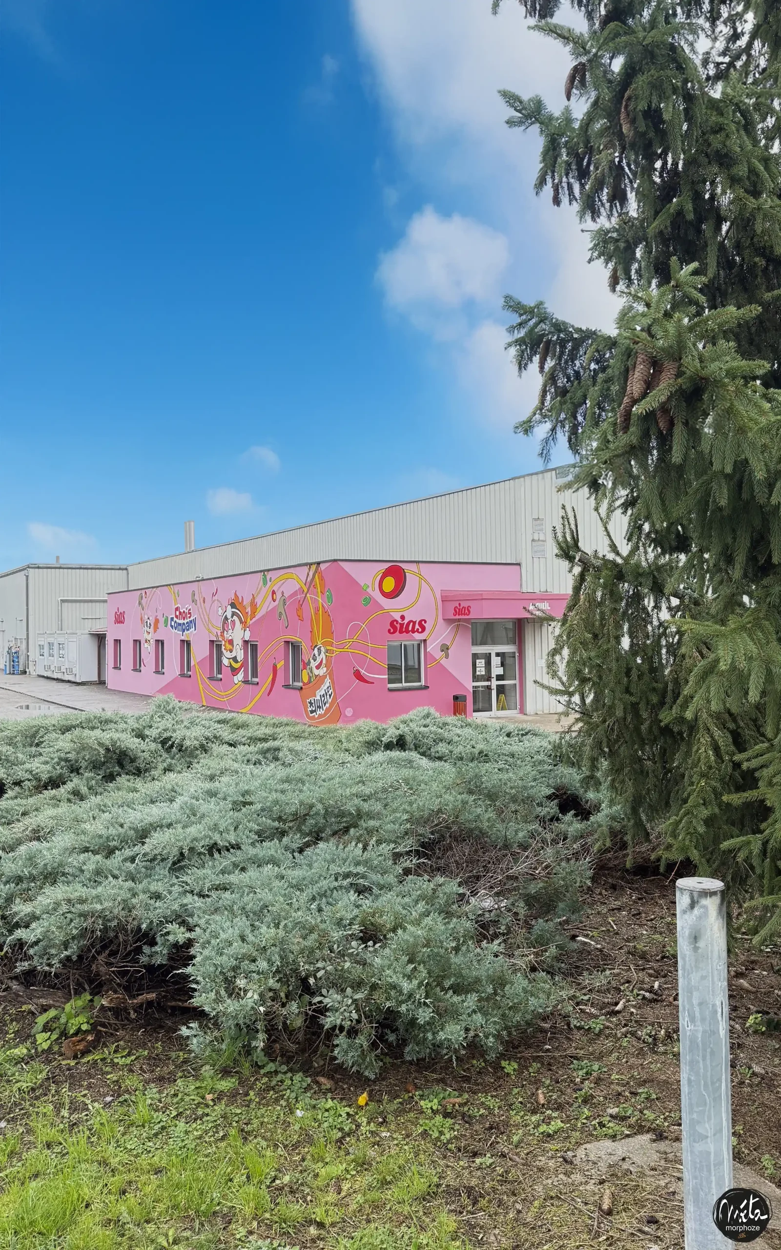
Visible from afar, this large-scale fresco transforms the main façade of the new factory into a strong urban signal. It attracts the eye, challenges and gives us a reading of a vibrant graphic universe, inspired by K-pop culture, Manga, and traditional Korean culinary culture.
Our artistic objective was clear: to create a dialogue between tradition and modernity, and to show how a company like Chois, while producing a popular and everyday product like Ramen, is a bearer of a collective culture, energy and creativity.
The fresco is therefore not just a wall covering: it embodies a philosophy.
She says the food is also a cultural symbol, a link between generations, a source of national pride and an artistic expression.
The visual narrative: a Korean story told in pictures
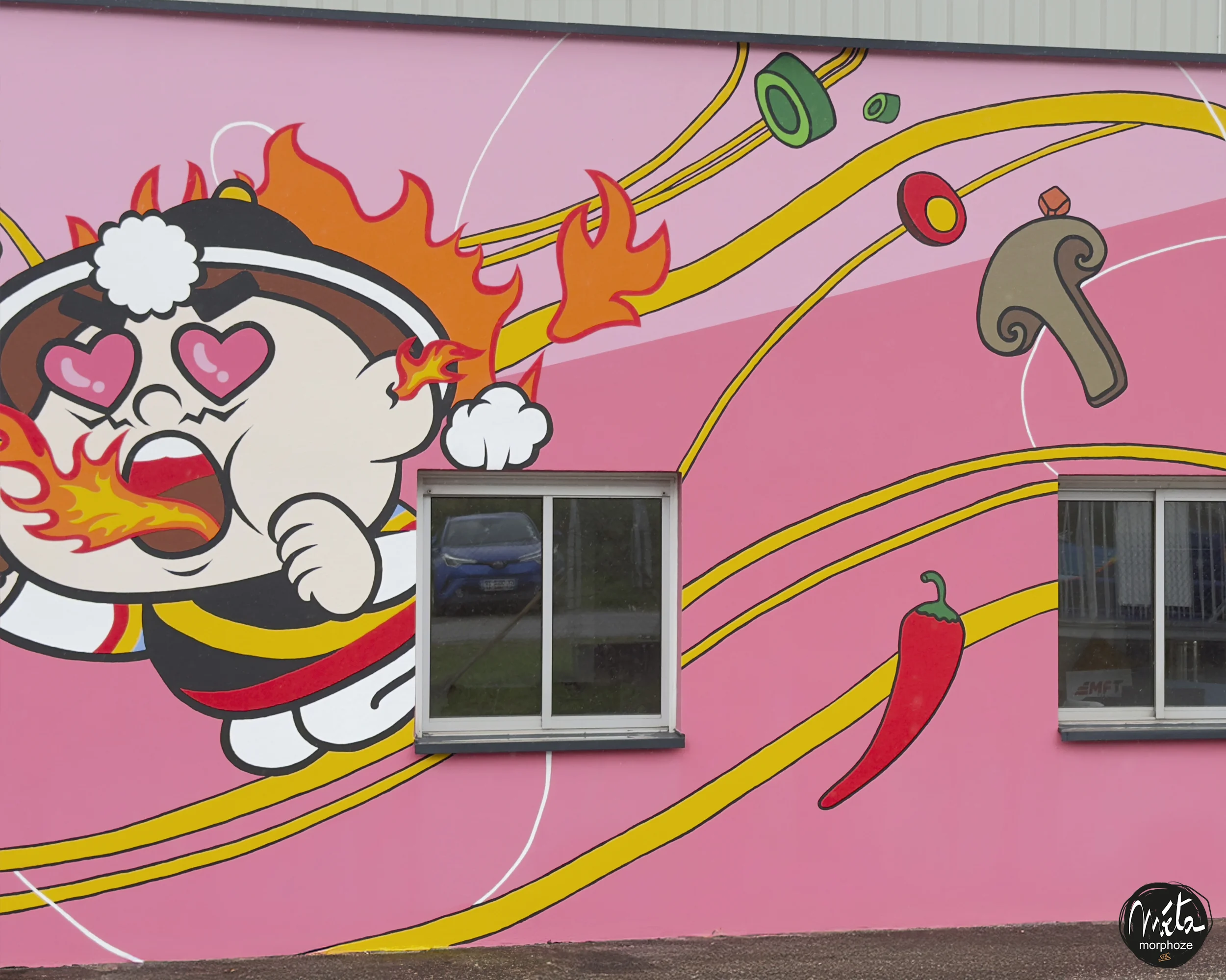
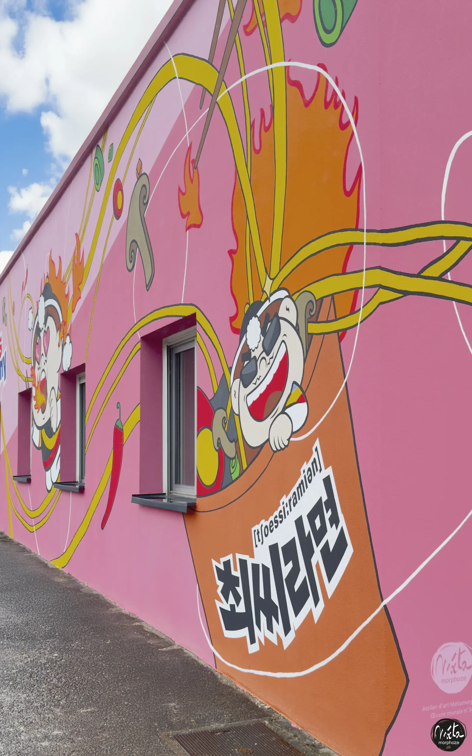
1. The origin: nature and ingredients
It all starts with the land, water and vegetables.
At the basis of the graphic narrative, we have represented the essential ingredients of Ramen :
- red chili peppers, symbols of Korean spicy cuisine,
- onions, garlic and fresh vegetables,
- the wheat and cereals from which the noodles are made,
- and even stylized plants, as a metaphor for growth, life, transmission.
These naturalistic elements, painted with 3D volume and texture effects, immerse the viewer in a sensory and gourmet universe. The shapes are fluid, the curves evoke the movements of the dough as it twists and stretches — a discreet nod to the Ramen-making process.
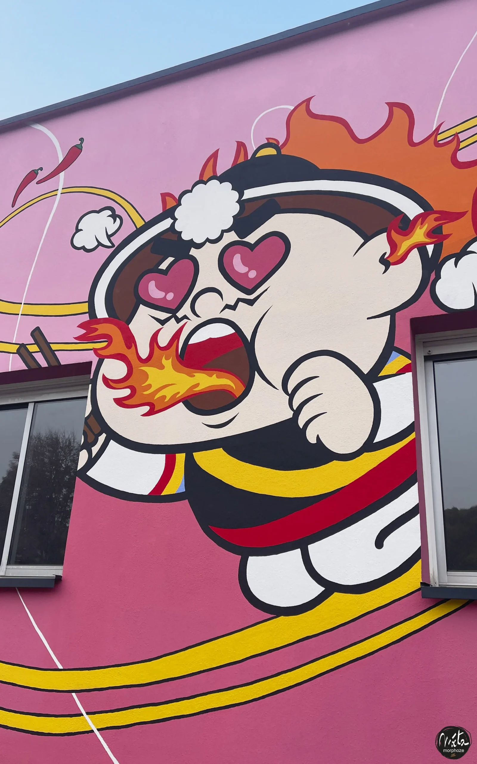
2. The heart: the Manga character, symbol of POP culture
At the center of the composition is a main character, inspired by the Manga and K-pop universe, but designed especially for Chois.
Her expressive face, large, bright eyes, flamboyant hair and energetic gesture embody youth, creativity and enthusiasm – all values that the company wants to pass on to its employees and audience.
This character becomes the graphic ambassador of the brand. He speaks to the new generation, the one who consumes Ramen Chois as much for the taste as for the aesthetics and conviviality they convey.
Korean culture, which is now radiant all over the world thanks to K-pop, cinema and gastronomy, is translated into a universal, accessible and joyful visual language.
3. Movement: the fusion of culture and innovation
The fresco is organized around a dynamic visual rhythm :
Curves, waves, bursts of color that guide the eye like a flow of flavors and emotions.
These graphic movements evoke:
- the steam rising from a bowl of Ramen,
- the dance of ingredients,
- but also the creative breath of a company in full international expansion.
Each section of the fresco is thought of as a sequence of the same narrative — from material to emotion, from nature to taste, from work to celebration.
Hand painting: the precision of the gesture and the nobility of the know-how
This monumental fresco, made entirely of acrylic paint, is the result of precise craftsmanship, carried out over several weeks by our team of mural painters.
Each shade, each shadow, each sliver of light has been worked by hand, in order to restore the vibration of the material and the intensity of the gesture.
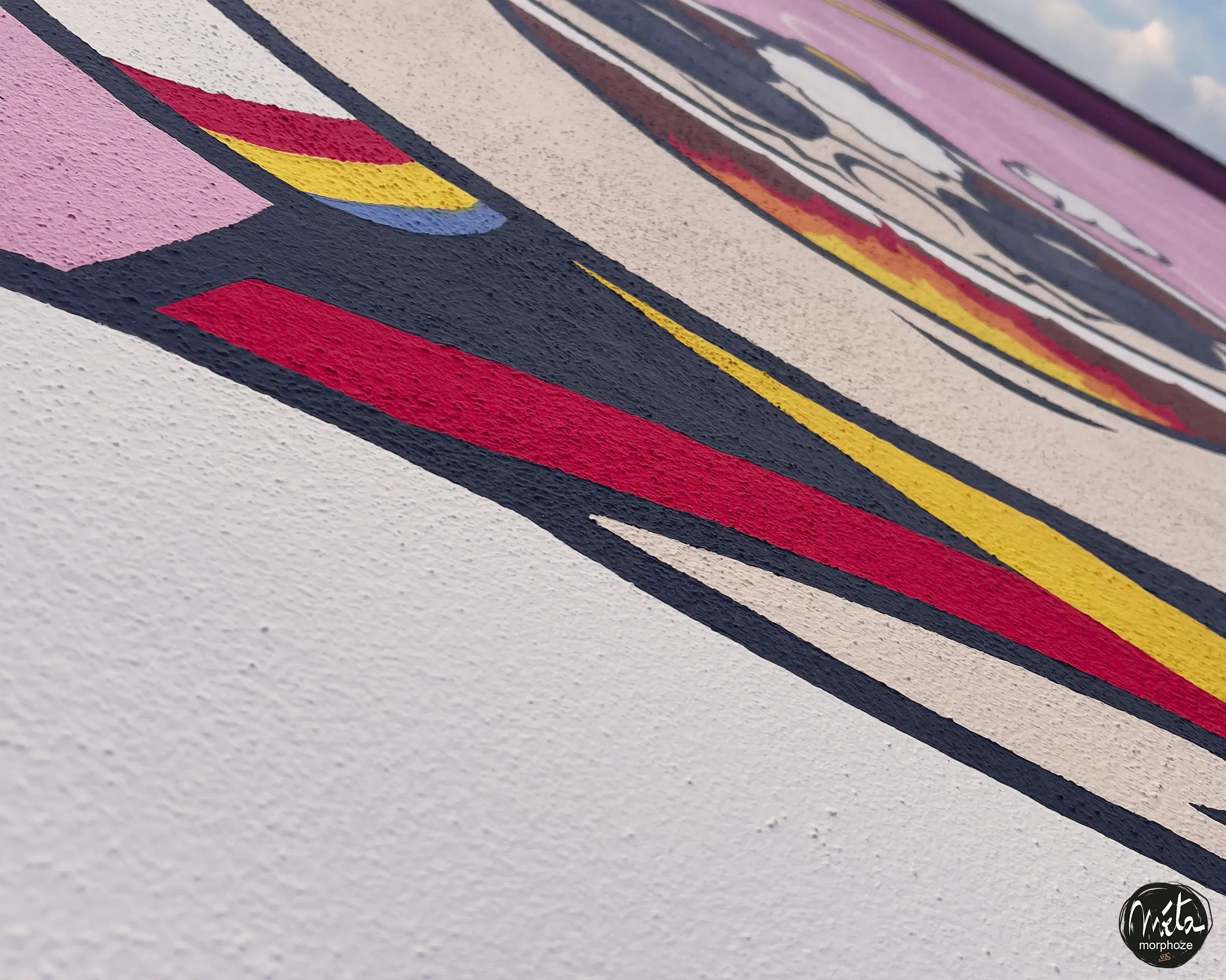
The three-dimensional effects we developed give the composition a spectacular depth.
Depending on the daylight, the fresco seems to change in texture and relief :
The gold warms up, the reds intensify, the whites become pearly.
This traditional pictorial approach, combined with a resolutely contemporary graphic universe, creates a bridge between craftsmanship and modernity, between mural art and industrial design.
A bright and contemporary colour palette
The color palette is at the heart of the narrative.
We have favored saturated, bright and dynamic tones, faithful to Korean visual culture.
- The reds and oranges are reminiscent of the warmth of spicy dishes, the vital energy and passion of the Korean people.
- The bright yellows bring joy and greed.
- Deep blues and purples add contrast and a touch of prestige.
- White and black ensure balance, legibility and elegance of the design.
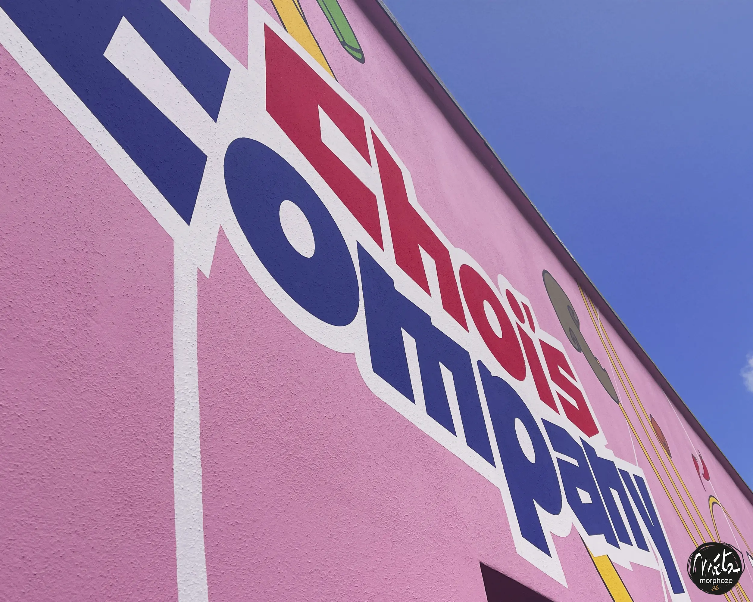
The whole composes a clear, festive and structured visual language, immediately identifiable, which allows the fresco to be recognized from afar, as a cultural and architectural signature.
A fresco to enhance the employer brand and attract the younger generations
One of the major challenges of the project for Sias et Chois was to strengthen the attractiveness of the site — both to its employees, young talents and visitors.
In a world where a company’s image is as important as its performance, it was essential to give this factory a soul, a personality and a strong visibility.
This fresco therefore plays several roles:
-
It humanizes the workplace.
It transforms an industrial wall into an emotional landmark.
Employees find a pride in belonging.
-
It strengthens the employer brand.
The factory became an emblematic site, a space where it was good to work, where creativity had its place.
-
It attracts the new generations.
With its references to Manga and K-pop culture, its pop colors and its narrative universe, the mural speaks directly to a young, curious and visually connected audience.
-
It promotes Korean culture internationally.
By assuming a strong aesthetic, the brand displays its cultural identity and artistic audacity, while being part of a universal graphic language.
A colour code and a style for a new visual identity
The choice of a colourful, contemporary and prestigious identity was obvious from the first sketches.
The factory is not only a production space: it is also a showcase, a place to visit, a symbol.
Gold, intense reds, powerful contrasts, 3D lighting effects: everything contributes to creating a strong visual impact, but always controlled, coherent, and in the image of the brand.
The entire site, through this fresco, adopts a new graphic coherence.
The façade becomes an artistic calling card : a landmark in the industrial landscape and a point of pride for the Chois and Sias teams.
A work rooted in Korean culture, open to the world
This fresco also illustrates the group’s vision:
that of a local company in terms of its roots, but global in terms of its culture.
Ramen, a simple and universal product, becomes the pretext for a wider celebration — that of creativity, youth, conviviality.
Manga, K-culture, Korean gastronomy: all these elements blend here to form a joyful and unifying visual language.
The mural becomes a brand ambassador :
- visible to all,
- readable at all levels,
- open to all interpretations,
- and immediately recognizable.
A work for today and tomorrow
This creation is part of a sustainable approach:
- Resistant acrylic paints, suitable for outdoors and climatic variations.
- A handcrafted pictorial technique but designed to last.
- A symbolic design capable of evolving with the site and the history of the company.
The fresco will live with the place: it will develop a patina, soften, but will always keep its brilliance, its energy and its meaning.
Mural art as a lever for identity and attractiveness
Through this monumental fresco, Sias and Chois have chosen to place culture at the heart of their corporate identity.
They affirm that industry can be a bearer of emotion, meaning and beauty, that walls can speak, inspire and federate.
As mural artists, we are proud to have contributed to this visual renaissance : a work that unites employees, attracts attention and makes the Chois brand shine far beyond its industrial site.
A monumental fresco outside, a culture celebrated, a brand sublimated.
Color. Energy. History. Pride.
This is what the façade of the new Chois factory now tells.